This is part 3 of HTML Form series. You can read previous parts here. In this part you will learn about Email Field Control, Radio Button and Checkbox Control.
HTML 5 Email Field Control
The email field control is in new in HTML 5. <input> elements of type email are used to let the user enter and edit an e-mail address, or, if the multiple attribute is specified, a list of e-mail addresses.
It validates the text for correct email address. You must use @ and . in this field. If user does not enter the correct email, then it will display error. The input value is automatically validated to ensure it is a properly formatted e-mail address.
Example
<!DOCTYPE html>
<html lang="en">

<head>
    <meta charset="UTF-8">
    <meta http-equiv="X-UA-Compatible" content="IE=edge">
    <meta name="viewport" content="width=device-width, initial-scale=1.0">
    <title>HTML 5 Email Field Control</title>
</head>

<body>
    <form>
        <label for="email">Email: </label>
        <input type="email" id="email" name="email" /> <br />
    </form>
</body>

</html>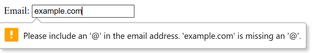
Radio Button Control
The radio button is used to select one option from multiple options. It is used for selection of gender, quiz questions etc. It allows the user to select one option from a range of options.
<input> elements of type radio are generally used in radio groups—collections of radio buttons describing a set of related options.
Only one radio button in a given group can be selected at the same time. The radio group must have share the same name (the value of the name attribute) to be treated as a group. You can have as many radio groups on a page as you want, as long as each group has its own name.
Once the radio group is created, selecting any radio button in that group automatically deselects any other selected radio button in the same group.
The <input type="radio"> defines a radio button. Radio buttons are typically rendered as small circles, which are filled or highlighted when selected.
The value attribute defines the unique value associated with each radio button. It is not shown to the user, but is the value that is sent to the server on “submit” to identify which radio button that was selected.
Example
<!DOCTYPE html>
<html lang="en">

<head>
    <meta charset="UTF-8">
    <meta http-equiv="X-UA-Compatible" content="IE=edge">
    <meta name="viewport" content="width=device-width, initial-scale=1.0">
    <title>Radio Button Control</title>
</head>

<body>
    <form>
        <label for="gender">Gender: </label>
        <input type="radio" id="gender" name="gender" value="male" />Male
        <input type="radio" id="gender" name="gender" value="female" />Female
    </form>
</body>

</html>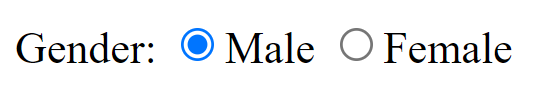
Radio Buttons vs Checkboxes
It’s important to understand the difference between radio buttons and checkboxes.
Checkboxes are similar to radio buttons, but with an important distinction: radio buttons are designed for selecting one value out of a set, whereas checkboxes let you turn individual values on and off.
Checkboxes differ from radio buttons, in that, checkboxes allow the user to select any number of options, whereas radio buttons allow the user to select one option only.
Radio buttons are better suited when you only want the user to select one option (eg, Male/Female, Yes/No, etc).
Checkbox Control
<input> elements of type checkbox are rendered by default as boxes that are checked (ticked) when activated. It is a form element which allows users to select one or more options from the given options.
These are similar to radio button except it can choose multiple options at a time and radio button can select one button at a time, and its display.
checked attribute
You can set a default value by using the checked attribute. It is a Boolean attribute indicating whether or not this checkbox is checked by default (when the page loads).
Example
<!DOCTYPE html>
<html lang="en">

<head>
    <meta charset="UTF-8">
    <meta http-equiv="X-UA-Compatible" content="IE=edge">
    <meta name="viewport" content="width=device-width, initial-scale=1.0">
    <title>Checkbox Control</title>
</head>

<body>
    <form>
        Programming Languages: <br>
        <input type="checkbox" id="C" name="C" value="C" />
        <label>C</label> <br>
        <input type="checkbox" id="Java" name="Java" value="Java" checked />
        <label>Java</label> <br>
        <input type="checkbox" id="Python" name="Python" value="Python" />
        <label>Python</label> <br>
        <input type="checkbox" id="PHP" name="PHP" value="PHP" />
        <label>PHP</label>
    </form>
</body>

</html>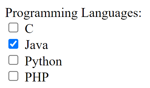
Radio buttons allow the user to select one option only. Checkboxes allow the user to select any number of options.