In this tutorial you will learn about “How to create Responsive Top Navigation using HTML, CSS and JavaScript?”.
To create responsive top navigation follow below example.
<!DOCTYPE html>
<html>
<head>
<meta name="viewport" content="width=device-width, initial-scale=1">
<style>
body {
margin: 0;
font-family: Arial, Helvetica, sans-serif;
}
/* Add a black background color to the top navigation */
.top-nav {
overflow: hidden;
background-color: #333;
}
/* Style the links inside the navigation bar */
.top-nav a {
float: left;
display: block;
color: #f2f2f2;
text-align: center;
padding: 14px 16px;
text-decoration: none;
font-size: 17px;
}
/* Change the color of links on hover */
.top-nav a:hover {
background-color: #ddd;
color: black;
}
/* Add an active class to highlight the current page */
.top-nav a.active {
background-color: #04AA6D;
color: white;
}
/* Hide the link that should open and close the top-nav on small screens */
.top-nav .icon {
display: none;
}
/* When the screen is less than 600 pixels wide, hide all links, except for the first one ("Home"). Show the link that contains should open and close the top-nav (.icon) */
@media screen and (max-width: 600px) {
.top-nav a:not(:first-child) {
display: none;
}
.top-nav a.icon {
float: right;
display: block;
}
}
/* The "responsive" class is added to the top-nav with JavaScript when the user clicks on the icon. This class makes the top-nav look good on small screens (display the links vertically instead of horizontally) */
@media screen and (max-width: 600px) {
.top-nav.responsive {
position: relative;
}
.top-nav.responsive .icon {
position: absolute;
right: 0;
top: 0;
}
.top-nav.responsive a {
float: none;
display: block;
text-align: left;
}
}
</style>
</head>
<body>
<div class="top-nav" id="top-nav-container">
<a href="#home" class="active">Home</a>
<a href="#news">News</a>
<a href="#contact">Contact</a>
<a href="#about">About</a>
<a href="javascript:void(0);" class="icon" onclick="myFunction()">
☰
</a>
</div>
<div style="padding-left:16px">
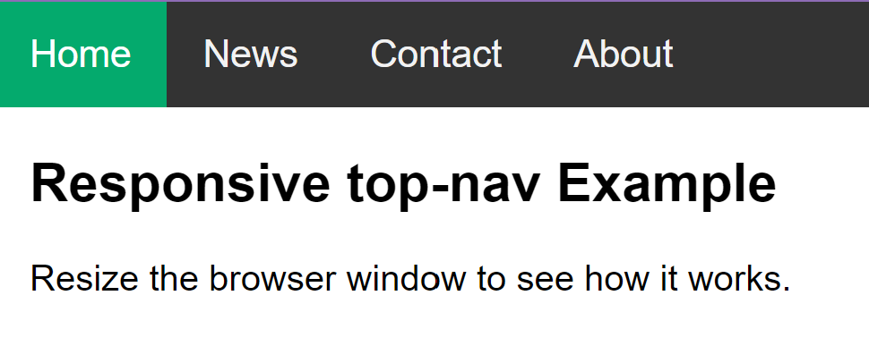
<h2>Responsive top-nav Example</h2>
<p>Resize the browser window to see how it works.</p>
</div>
<script>
/* Toggle between adding and removing the "responsive" class to top-nav when the user clicks on the icon */
function myFunction() {
var x = document.getElementById("top-nav-container");
if (x.className === "top-nav") {
x.className += " responsive";
} else {
x.className = "top-nav";
}
}
</script>
</body>
</html>Output
Explanation
First put all menu links inside “div”.
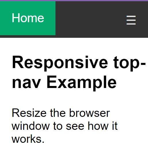
Note that ☰ is an HTML entity that displays the ☰ (hamburger icon.)
When the screen is less than 600 pixels wide, hide all links, except for the first one (“Home”).
The “responsive” class is added to the top-nav with JavaScript when the user clicks on the icon. This class makes the top-nav look good on small screens (display the links vertically instead of horizontally).
To toggle between adding and removing the “responsive” class to top-nav when the user clicks on the icon we used JavaScript.